About:
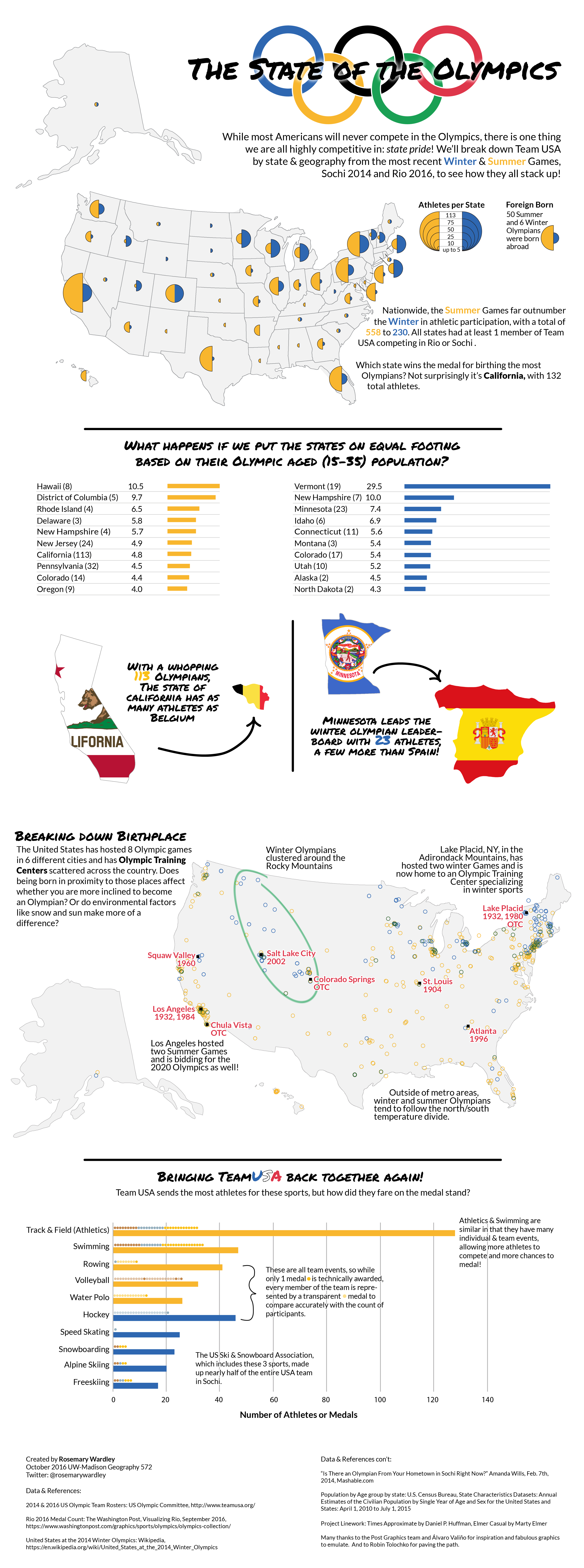
The Olympic Games are never lacking in entertainment or dramatics, heck I watch them as much for human interest stories as for athletic competition! Therefore they seemed like a perfect topic for a project to practice infographic design and visual storytelling!
Process:
For my project I decided to look at data for Team USA through a geographic lens and see if we could pull out any interesting patterns or phenomena. One requirement was that our infographic include a bivariate map, a thematic style that I admit I'm not in the habit of using all too often. Bivariate maps are a challenge in visual storytelling since they require the user to interpret two variables in one display. Combine them with stats and graphs in an infographic and you have a visual overload waiting to happen!
Outcome:
Overall, I'm pretty pleased with how my infographic turned out. I enjoyed the challenge of taking raw statistical data and figuring out how to weave it into an interesting, clear, and cohesive story. I also enjoyed using new graphic design tools and techniques beyond the cartographic ones I was already accustomed to!
